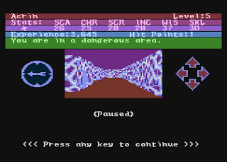
Now that release 0.42 of ARX is out I’ve started on the next set of fixes and additions. A few people had commented that some of the Dungeon map zones were displaying the wrong textures and colours so I thought I would look at fixing these. For example the areas around the Dungeon Chapel had a bright white floor and the Blink Mine area kept displayed the City mountains as a background -Interesting but not really true to the original game!
After a bit of digging I reacquintainted myself with the zones system. Basically the Dungeon designers set up a system where you could define a “zone” by specifying a pair of X and Y co-ordinates on the Dungeon map. These are used to control the colours, textures used (eg. rock walls, ice crystals in the crystal caverns), types of encounters (e.g. lots of guards around the bank vaults) and anti-magic zones. It’s an efficient system (as you only specify 4 numbers to define the area) and I might use something similar for some sections of Stone of the Citadel.This is one of the things I like about AR over other games of the time – the variety of different area styles as opposed to other games which had one set of wall graphics for the entire game.
 |
| The original Dangerous Area |
 |
| The ARX Dangerous Area |
Anyway I focused on the southwest area of the Dungeon map and went through every area and zone there to match them up and add any new styles and colours required. I haven’t matched all the colours and areas exactly, partly because the colours in the version of Atari800Win I’m using didn’t look quite right to me but also because I could spend a lot of time making every area look exactly the same and most players won’t remember the exact scheme. This area of the map is now nicely tidied up and all the zones look sensible. I’ll move onto other areas shortly.