CRPG Visuals – My thoughts

One of the challenges of creating a CRPG for the Commodore 64 is deciding what sort of visual style I would like for the game. I’m working with an overhead view as I think that plays well to the C64’s capabilities and I’m a big fan of top down games such as the Ultima series and Legacy of the Ancients.
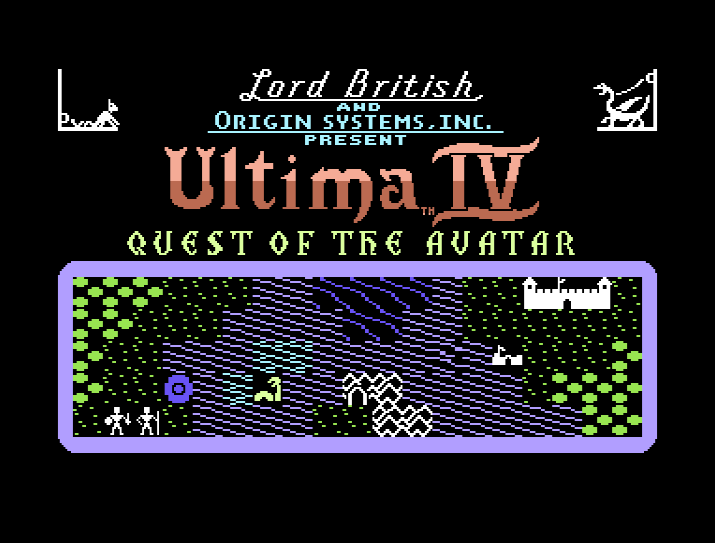
Ultima IV on the C64

Whilst my options with the C64 are more limited than modern machines, I still have many decisions to make on the visuals front (putting aside my lack of artistic talent for a moment).

The C64 has a number of display modes with a maximum screen resolution of 320 x 200 pixels (or 40 x 25 character cells) in a choice of 16 colours. If I’m willing to sacrifice the horizontal resolution of the display then I can increase the number of colours I can use in each 8 x 8 pixel “character” cell from 2 colours to 4 colours but this will double the horizontal size of each “pixel”. You can see this in the image below. You also have the choice of bitmap versus character modes. This is a big over simplification of the capabilities of the machine but will hopefully suffice for this post.
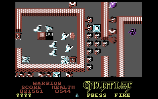
Gauntlet on the C64 – Illustrating the use of multi-colour mode (image from MobyGames)

Currently I’m using character mode to redefine the 256 character set with my own characters and then piece them together to build up maps on the screen. The player moves around the map and can move to other map sections when the end of the current map is reached.

If I required more colour in each character cell I could use multi-colour mode but this tends to make the graphics look more “chunky”. If I require more detailed graphics then I could use bitmap mode but at the cost of additional memory (8Kb for a full 320×200 screen).

One of the other challenges I’m facing is trying to make interesting displays with individual character cells which are only 8 x 8 pixels wide. Now the Ultima games and most CRPGs of the 1980’s typically used 4 character cells to build each of it’s map tiles, doubling the resolution of each tile but halving the number of tiles you can display on screen. The Ultima display also kept the party icon centred in the map display with the map being redrawn around the player after every move.
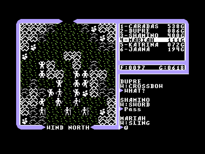
Combat in Ultima IV illustrating the use of 16 x 16 pixel tiles

One of the things I like about using the individual characters as tiles rather than 2 x 2 characters per tile, is that it allows me to display more of the map on screen at a time but at the loss of some graphical detail. I’ve started playing around with some of the redefined characters and colours in the CBM PRG Studio screen editor which is great for creating simple graphics and prototyping screen displays. Programming single characters as tiles is also a lot easier for me as well and will perform more smoothly in play.
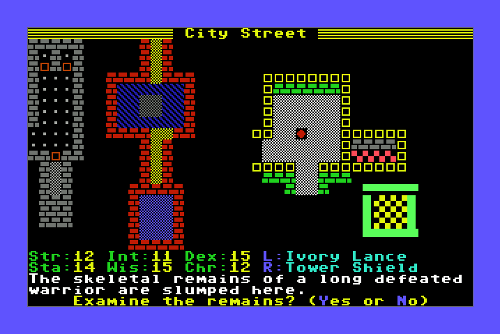
Playing around with some redefined characters and colours to build an on-screen map

I’ve included a sample image above of my brief sketches so far. Regardless of what screen mode and tile size I eventually use I’m also likely going to use the C64’s sprites as a means of adding higher resolution images for the player character, NPCs and monsters. These have the benefit of being independent of the screen display so can have their own colours, hires or multi-colour mode option so can be used to add some further interest to the display.

Help to Enhance Alternate Reality X

Hi there,

I’m trying to raise some additional funding through Paypal donations so that I can invest in better graphics software, off the shelf resources and/or some commissioned art. If you feel you could help out with any donations (however small) towards the project they would be greatly appreciated. Donations received will go directly back into the project to enhance it and allow Alternate Reality X to reach its maximum potential.


The project is now very lucky to have a professional musician working on the project and he’s doing some great work including content for the Arena, Palace and Wilderness scenarios. The new sound effects and music are really going to add significantly to make ARX come alive and have an even better atmosphere than the original I feel.

How will extra funding help? If the project can obtain some more substantial funding (don’t worry I’m not thinking Project Eternity here!) then it will give the project a lot more options about how we can develop it. The most common request I receive is to develop the remaining scenarios and whilst I have plenty of ideas of how the gameplay, mechanics, new features and story may develop, these scenarios will all require new visuals and graphic content if they are to be effective and enjoyable.

For basic graphics work I’ve been using Paint Shop Pro and its ok but it would be good to upgrade as it’s several major versions / many years behind and a bit buggy. Some 3D modelling software would allow us to produce 3D models and renders for new animated encounter graphics, animated shop interiors rather than the current static ones and some rendered 3D objects for the other scenarios to make the environment that bit more interesting. Maya was one I looked at briefly but I would look again before spending any money / funds. Another option would be software that can export to a 3D object format as well so that I could display the model geometry using OpenGL (Milkshake I think is one) for real 3D encounters which could maybe even be visible in the distance rather than just appearing at point blank range.

I have attempted to attract a serious artist to the project but no one seems interested and I’ve asked in several quarters where I thought I’d get good responses. I also contacted someone who had done art for a similar project which I liked but he has no interest in contributing to ARX. I am also considering commissioning an artist to do graphics but I would expect this to cost a fair bit which the project / I can’t fund at the moment.

I’ve also come across some excellent graphic resources such as textures and images which would be ideal for ARX but you need to pay for them – using these would save considerable time in developing my own and provide much better quality results than I can manage or that free resources can provide.

Some more funding will allow us to be able to consider these options seriously though and to produce the quality of imagery and potential of  what ARX could be and that we all hoped for with previous Alternate Reality related projects.

Thanks for your continued support for ARX.

All the best,
Acrin1

Alternate Reality X – Display timing issues

I recently posted on the 8 bit Atari Age forums and some of the regulars there who’ve responded to my AR X posts over the last couple of years reminded me of an often mentioned issue which I’ve still to fix. This is the high speed which the City and Dungeon gate counters spin around. I’m not currently timing the speed with which different computers should display things on the screen which means some people find this very frustrating as it’s way too fast.

Along with the save game facility I’ll aim to fix this problem in the next release. I know what SFML commands I need to look at to help with this and once I’ve worked it out this will hopefully help me to be able to tackle others features such as encounter animation and on screen timed song lyrics.

Rogue’s Gallery

Spent some time at the weekend collecting more Encounter images and preparing them for use in the current release. My method for capturing these is pretty tedious but doesn’t take too long as there aren’t too many different encounter graphics and some are reused for different types of encounter. I basically save screenshots from within the Atari800Win emulator, cut out the encounter image, double it’s size to fit a 64×128 pixel OpenGL texture and then remove any unwanted background. In future I’ll need to capture the additional animation frames that many encounters have but for now encounters aren’t animated.


I also had a play with some of the Eye of the Beholder graphics I’ve used previously but I think I’ve decided not to use these as they are limited in number leaving many AR encounters without updated graphics. Here are a couple of examples anyway.

Currently I’m creating black and white masks for each encounter image but I’m hoping that I might be able to do away with this possibly by using OpenGL’s display lists. The AR font is drawn using this method and seems to work fine and doesn’t require any manually created masks. Browsing round the web I found a program called GraphicsGale Free Edition which is a sprite editor that might be useful for hand editing of the original AR encounter graphics.

I’ll need to set aside a lot of time if I end up hand editing all these original images…

Next steps

It’s been a while since I’ve released any updated versions of the demo so I’ve been thinking about what features I’d like to add next. I drew up a list but as it has a few dozen items on it I won’t repeat it here just now – too depressing!

One of the features of the original game that I hark on about all the time is the wide variety of objects you could find. There are large numbers of weapons, magical trump cards, scrolls, wands etc – certainly more than any other CRPG of the time that I can think of. Since version 0.4 I’ve added in support for dealing with the numerous objects in the Dungeon. So far I’ve added in some basic support for weapons. This means that you can now pick up any weapons dropped during encounters, equip them, swap them from primary to secondary and also use torches as weapons (they do both blunt and fire type damage). Different weapons have different effects during encounters E.g. don’t fight a Flame Demon with a Flamesword as it makes them stronger!

There are a lot of “specials” in the original game where you stumble across a special, one of a kind item. I’d like to add some of the weapons shortly. It will take me a fair bit more work to add in all the objects and their different effects. Some of the objects are quite complex providing special bonuses or unforeseen side effects. I’ve yet to decode the macro language used in the original game in order to understand how these objects work. I’m using the real object data from the original game and hope to be able to add all the objects in one go.

I still can’t help playing around with various graphics. The really difficult ones are the encounter graphics and shop interiors. My sensible side says use the original graphics for now and concentrate on replicating the game functionality but I’m also keen to try and update the look of the game a bit. The problem with graphics is that they are very time consuming to produce, especially if like me you don’t have any artistic skill. Ideally I was hoping a skilled artist might be interested in updating them but no luck so far. Eventually I’ll have a go myself. There seems to be no shortage of tutorials on the web! I’d also like someone to smooth out the AR font as I’ve doubled its original size making it look a bit blocky. If you’re interested in helping out let me know.

The other thing I’ve been working on is the portal room with spinning counters. I had this working nicely under my original SDL demo back in the mists of time but still don’t have the counters appearing in the right place since I’ve moved to SDL with OpenGL for graphics and increased the window size from 320×240 to 640×480. I know I should really sort something out with different window sizes and scalers but I’m leaving this for the time being. Currently the counters scroll out of sight – just need to spend a bit of time getting the coordinates right. Trial and error.